T-Mobile store redesign
CASE STUDY

A UX study that resulted in the is a re-design of T-Mobile’s online store.
In 2011-12 AT&T attempted a merger with T-Mobile. I was on assignment with the company at the time and used the acquisition phase as an opportunity to re-imagine the online shopping experience.
One day a high level executive walked by my office and saw my computer screen. He asked what I was working on and I informed him that I had spent some time imagining what a new T-Mobile could look like. The executive was so impressed with my walk through that they asked me to take lead on the redesign and followed up by offering me a full time position with the company.

During an acquisition between two companies, progress is frozen. AT&T had attempted to acquire T-Mobile but was not able to get approval. T-Mobile was now looking to what was next for the future of their brand… they ended up asking for my help.
I was on contract with T-Mobile during the acquisition process and we essentially were just waiting around until we knew if the merger would be a success. Because I can’t just sit in a chair collecting paychecks, I took the time to imagine what I thought the online store should look like. The biggest issue I identified was that the store felt like a template that lacked emotionless or passion. Meanwhile - Evidence was everywhere that showed that people had very personal and emotional connections to their mobile devices.
Wanting to embrace the emotional connection, I created something more visual that focused on creating delight and simplifying how T-Mobile listed inventory.
The result of my study was that I was asked to redesign the online experience for the T-Mobile store, which launched in the spring of 2012.
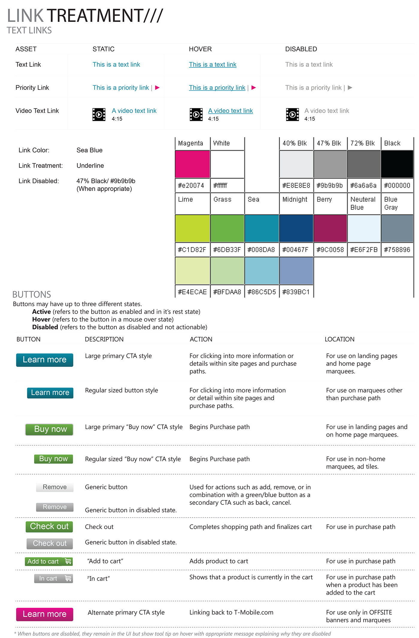
Step one: A site audit & UI simplification.
One of the first things that needed to happen, was that I had to look through all the major calls to action and design cues that had sort of drifted off brand through the years.
I went through the entire website and documented every link and call to action. I looked at all the various UI cues and compiled them into a document with details about how they functioned and where they were located.
The first thing I had to do was develop a more unified brand guide that better aligned to the existing marketing and intended global perception.
I did this by looking for common patterns and similarities within all the various UI elements. Once I defined the intention of each CTA, I looked for ways to combine patterns that felt redundant. This brought increased clarity and set an expectation with our customer base of what each element would do.
Unifying this experience also gave me a lot of insight into ways we could improve customer engagement.

Step two: The low hanging fruit
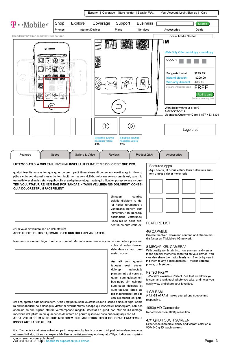
The store showed product list by SKU number. Each variant of the product resulted in a new SKU. This meant a customer could visit the store and see as many as 15 thumbnails of devices that looked identical, but may have slightly different storage or color options.
I combined all SKU (Stock Keeping Unit) variants for each product into a panel that would change pricing and view state based on the options a user selected within the panel. This created a larger variety of products in the list view and allowed us to increase the size of each panel to show a better resolution of the product. If a customer chose a color option in the panel, the SKU, Image, and price would all change on the spot to reflect the choices of the consumer.
This same functionality was present on the detail page for each product and can still be seen in action today.
VIEW - T-MOBILE PRODUCT PAGE SAMPLE
While some of the architecture has evolved over the years, as it should, you will also note that a lot of my initial architecture is still present in the site structure.
Step Three: Creating delight in the product details.
Once I had finished working on the product list view, I turned to the detail pages. My intent was to use the same dynamic structure I used in the list view, to allow customers the ability to view all variants of a given SKU without having to conduct a new search, or leave the page.
The big change, however, involved increasing the visual element of the product detail pages. At the time, T-mobile was using literal thumbnails to represent the product. However - Our marketing landing pages were showing a lot of success with lifestyle driven landing pages that were highly visual and engaging.
It did not make sense to me that these pages should be so different. I created a hybrid design that took some of the peak visual elements of the marketing landing pages that we created for new products and combined it with a more detailed product view.
The result was a much more visual page that allowed us to track how customers looked at each landing pages, while also being able to identify that content that helped to convert them into the purchase funnel.
While T-Mobile has continued to grow over time… so has the UI evolved. However, when you look at my original designs, you will see that the skeleton of their online store is still largely based on my original UX architecture.