
Product testing platform
CASE STUDY

Executive Summary: Disney Quality Testing Platform Transformation
Client: Internal Disney software team
Engagement Lead: David Wall, UX & Prototype Designer
Scope: Accessibility audit, user research, usability testing, and final prototype delivery
The Business Challenge
Disney had an internal software platform used by multiple business units to validate new product features before release. Over time, the tool became hard to use, inconsistent with Disney’s brand standards, and overly complex — slowing workflows and increasing error-rates.
Despite its central role in daily operations, the platform was confusing for non-technical users, inefficient in use, and not mobile-friendly — negatively impacting productivity and confidence in test results.
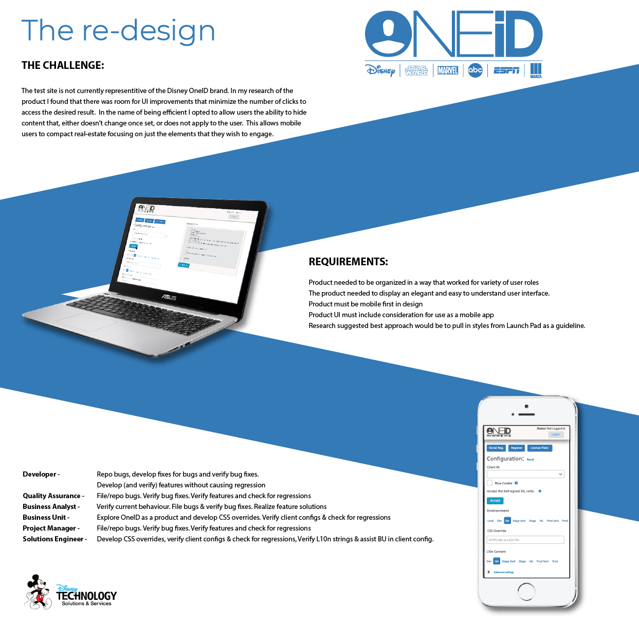
Strategic Objectives
The core objectives of the engagement were to:
Simplify the experience to reduce user frustration and increase adoption
Minimize unnecessary steps to accelerate task completion
Increase accuracy by reducing user error, especially among non-developers
Ensure brand consistency with Disney’s OneID identity
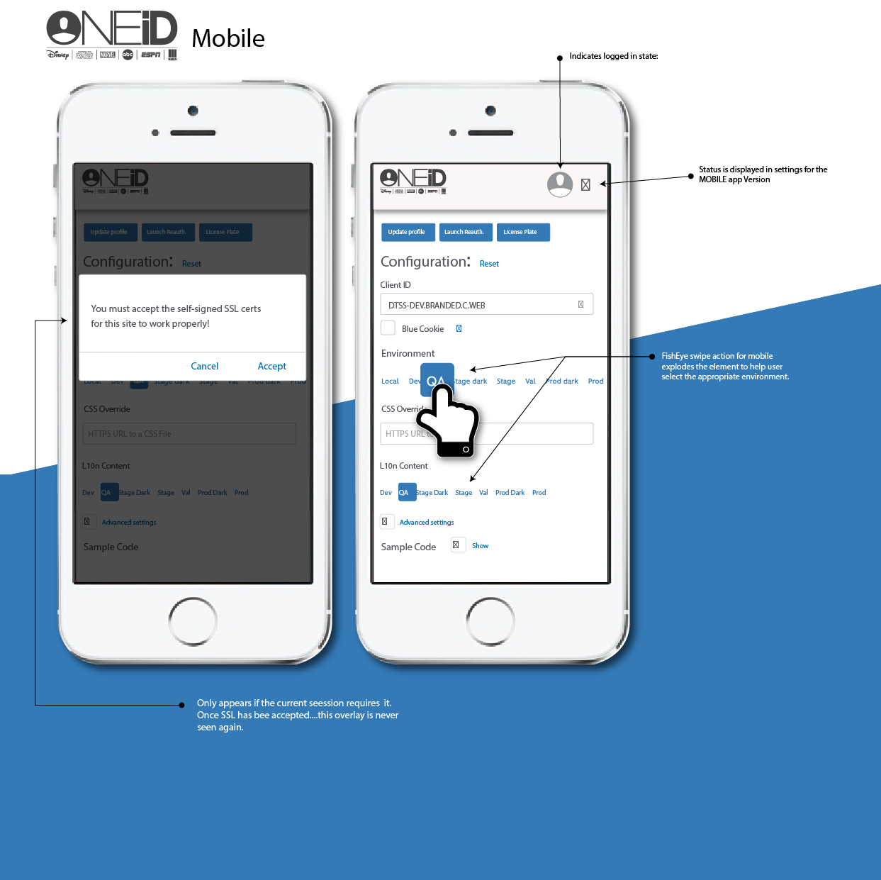
Enable mobile usability for field and remote users
Approach & Insights
Urban Analog undertook a thorough user-centered process that included:
Immersive user research: Two weeks of job shadowing with all major user groups to understand real-world workflows and challenges.
Role-based analysis: Mapped varying needs of developers, quality assurance specialists, business analysts, and other stakeholders.
Simplification and prioritization: Redesigned content and navigation to focus attention on the most essential actions for each user type.
Brand alignment: Applied design cues from Disney’s main applications to create familiarity and trust in the user interface.
Mobile-first mindset: Ensured the tool was equally effective on mobile devices, allowing broader flexibility in how teams worked.

Key Outcomes
Dramatically Improved Usability
By reorganizing the interface around user roles and eliminating irrelevant elements, users gained a clearer, faster path to accomplish their tasks. Navigation became intuitive, reducing cognitive load and training time.Increased Efficiency and Reduced Error Rates
Predictive text in form fields and cleaner form layouts decreased repetitive work and reduced accidental data entry mistakes — directly improving operational flow.Stronger Brand Experience and Trust
Aligning the tool’s look and feel with Disney OneID standards created a seamless experience that felt familiar and reliable to users, enhancing confidence during critical testing activities.Mobile Accessibility for a Modern Workforce
The platform became mobile-friendly without compromise, enabling teams to work more flexibly and respond faster across distributed environments.
Why This Matters for Global Leaders
This project demonstrates how thoughtful design — grounded in deep understanding of end users — can convert a neglected internal tool into an efficient, reliable asset. When teams are empowered with clarity and ease of use, productivity rises, error-costs fall, and confidence in mission-critical systems strengthens.